The hospitality industry is awash with fantastic branding. From Michelin star restaurants, to the local coffee cart that pitches up at the station, there are a lot of exciting designs around. As we've mentioned in the past,
branding is essential for making your business stand out but at the same time it still needs to be easily recognisable.
We've even mentioned on occasion that business owners in the hospitality industry should sometimes
spend more time worrying about marketing that works than spending all their efforts on creating super edgy designs and illustrations. If you've ever wondered what does qualify as "marketing that works" then you're not alone. It's a tricky question and widely debated.
Coffee Shop Logo Design Inspiration
There are going to be nuances that are very specific to your niche when it comes to logo and branding design. There's so much choice when it comes to picking fonts, icons layouts and overall styles it's impossible to know where to start. We'd always suggest that you carry out extensive competitor research into similar businesses so that you can get some ideas of what customers would expect if they were trying to find the sort of food and drink that you offer. Whether you call this process "design inspiration" or "creating a mood board" or "competitor analysis" you should be working towards the same results.
Orientating yourself to the visual styles of your sector and the effect that they have
So to show you how this is done we're going to take a close look at the specialty coffee industry. Our team has a ton of experience brewing, pulling shots, roasting and of course drinking fantastic coffee as well as creating fantastic designs for coffee brands. Even if you aren't in the coffee business yourself, here it's worth taking a look at the approach outline below so you know what to look out for in your own research.
Coffee Shop Icons
For several very good reasons, a lot of logos across all industries follow the "icon + business name" formula. It's a good formula. Our logo follows this formula. It works well for website design, easily fitting in the menu at the top of every page but still allows for the icon to be used by itself, be it on coffee cups, t-shirts or your Facebook page. We'd certainly suggest sticking to a simple and clearly identifiable icon like in the examples below. Line art and solid block illustrations of objects are a good shout. They'll look good and be easy to see if it's a floor to ceiling window graphic or a tiny icon viewed on a phone screen.

These are two of our favourite examples. You can clearly see the business name in a nice simple sans serif font. You immediately know that it's a coffee business and you've got a playful little illustration to go along with it. These are the monochrome versions but they'll work easily will in a brand colour palette or a wider range of colours, if perhaps a range of products has the same logo in a different colour. Of course you may spend a fair bit of time working out what that icon should be. But that's fine. If you can get that bit right early on then the rest will fall into place easily. There's lots you can do to play around with this part of the logo. For example you could just use a letter from the business name.

You may have noticed that these also have very similar layouts but there are some subtle variations. While the icon is consistently the same height as all rows of text there are variations when it comes to width. Should all text be aligned to the same width? And should it be squeezed onto two lines or split over 3? This will of course be somewhat determined by your business name, but it's something to think about if you haven't even got that far yet. If the text is centre aligned then you can opt for an "icon above text" layout, giving you a much bigger portrait layout logo which can work well on bags of beans, mugs or other tall promotional items.
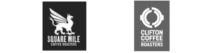
These examples also show how white on black (or at least grey) can offer a an interesting alternative to "black on white" while still keeping it monochrome. In this case, the icons are also a bit more nuanced, the griffin of Square Mile coffee harks back to the historic emblem of this London district while the Clifton coffee logo presumably refers to a porta-filter locking into the group of an espresso machine. It's how you twist and lock the handle that holds the coffee into a coffee machine. So something for coffee pros to pick up on. This does re-raise the issue of brand recognition. Would someone who saw these icons by themselves know they were coffee companies? Probably not but of course the word "coffee" gets rid of any doubt. If you don't have such a clear business name think about including an icon that does convey what you do. Of course, as you can see below, you don't have to have an icon at all if you don't want to.
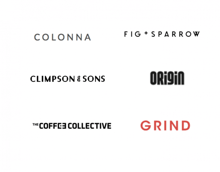
You'll see here that some of the fonts are a bit more interesting. Either using a bit of colour, some unusually spaced letters or or playing around with capitalisation. This can be a really strong approach to
cafe and restaurant logo design. Less is more and minimalism is certainly not going anywhere. If this is going to be your approach make sure you spend an appropriate amount of time on really refining the little details. How will you make your brand stand out? Will you use a very unique font, or just a very subtle tweak of something more conventional?
You may have also noticed that all of the fonts so far are sans serif. Maybe we'll come back and have a look at serif fonts another time, this of course is a completely different route to go down, a route that signifies a business that may be more formal or traditional. Which can be great when used in branding for the right kind of business.
So if you're still struggling for logo design inspiration for Cafes, start by looking at what other people have done. If you're still unsure about which route to take,
get in touch with our team of over caffeinated designers to discuss the branding for your new cafe, restaurant, bar, food truck or any other kind of food or drink vendor. If you've got great branding in place already, but you're struggling to get customers in the door, we offer a range of
marketing services for cafes as well as
local SEO services for cafes to get your cafe showing at the top of Google maps searches, driving foot traffic and generating new leads via your website.